New York Times COVID-19 Dashboard
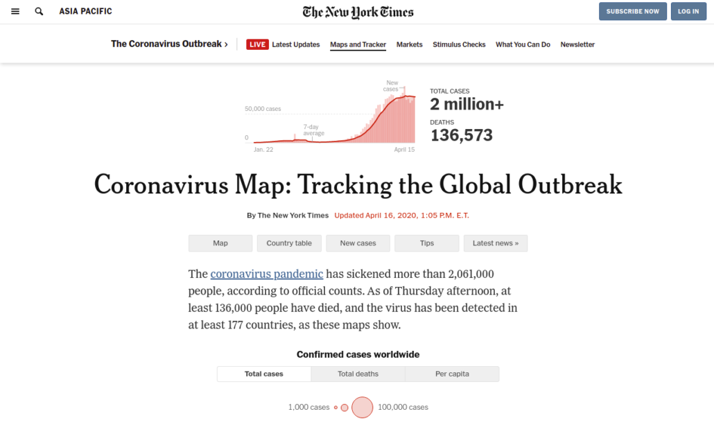
The New York Times COVID-19 dashboard displays a map of numbers of cases, deaths, and cases per 100,000 around the world. Another set of data shows case growth rates from January 22 to the present.
Views 840

The New York Times COVID-19 dashboard displays a map of numbers of cases, deaths, and cases per 100,000 around the world. Another set of data shows case growth rates from January 22 to the present.
Views 840

The COVID Communication Network website was originally developed by Breakthrough ACTION (USAID Cooperative Agreement #AID-OAA-A-17-00017) under the leadership of Johns Hopkins Center for Communication Programs. This website is now maintained by Johns Hopkins Center for Communication Programs and its contents are the sole responsibility of CCP. The contents of this website do not necessarily reflect the views of USAID, the United States Government, or Johns Hopkins University.

 List of COVID-19 Maps and Visuals (University of Minnesota)